Every year, HB brings a handful of graduates into the studio – people ready to jump in, learn fast, and start making work that matters. Our graduate programme moves quickly: real projects, real clients, real momentum. No sidelines. No waiting your turn. From day one, they see what we value – driving impact for our clients, everywhere their brand shows up, always.
Across the year, we’ve watched this years’ cohort settle into the studio, grow in confidence, and start shaping work that reflects their own creative voices.
We want to take a moment to celebrate their progress by sharing their personal projects and creative explorations. They’ve impressed us with their passion, craft and skill.
Well done team 👏👏👏
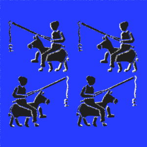 Stephanie – the album sleeve
Working with Merchants of Paradise by Gregory Porter, she followed the track’s themes of power and false promise. The “carrot and stick” becomes a sharper metaphor here, hinting at systems that push forward without letting them arrive. It’s thoughtful, symbolic, and very her – design led by meaning, not decoration.
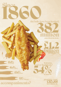 Verity – an infographic
Fish and chips became a neat data story. She pulled apart the small rituals of the meal, the paper, the vinegar, the familiar patterns, turned into a clear and lightly playful infographic, using vinegar as a smart textural detail. Clean, witty, and full of well-observed detail.
 Kairo – the blueprint
Six classic cars reimagined through engineering-style drawings. Stripped back, consistent linework turns each model into something measured and precise, almost schematic. Controlled, methodical, and quietly confident in its craft. Showing confidence experimenting with controlled engineering lines.
 Sonia – magazine culture
Her project began with quick, movement-led sketches that set the tone. As she pushed the work forward, it shifted into a bold, brutalist direction, where textured forms sit within a strong, ordered framework. That shift from openness at the start to clarity in the finish is the rhythm the work follows.
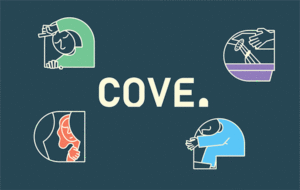 Mae-Ling – the cove
A calm, gentle brand concept centred around support for young people experiencing homelessness. Soft tones and simple illustration make the idea approachable without losing sensitivity. It’s warm, clear, and emotionally intelligent in its execution.
Congratulations to our 2025 graduate cohort on stepping into their roles as junior designers. They’ve got talent, grit, curiosity, and an overwhelming passion for creative communication. We’re so pleased to have you on the team.
You know who you are!